
Bathroom Makeover. One Room Challenge Spring 2021- REVEAL
The reveal is finally here!
I am so excited to share with you this awesome transformation. I am so grateful to the ORC and Better Homes and Gardens for this opportunity to show you my process and also be inspired by other participants. The best part, and most stressful, is meeting the deadline because it is such a huge motivation to finish a project you set out to do yourself.
This bathroom is ready to make any guest feel at home and I am so happy to finally see and touch what has been in my mind for this space for what seems like years. It is so rewarding to design a space that can make anyone stop to take a better look and feel their surroundings. This is exactly what I wanted for this space, and even though some weeks proved to be hard, I was determined to make this design a reality.
First, let's take a look down memory lane and go through the bathroom 8 weeks ago…
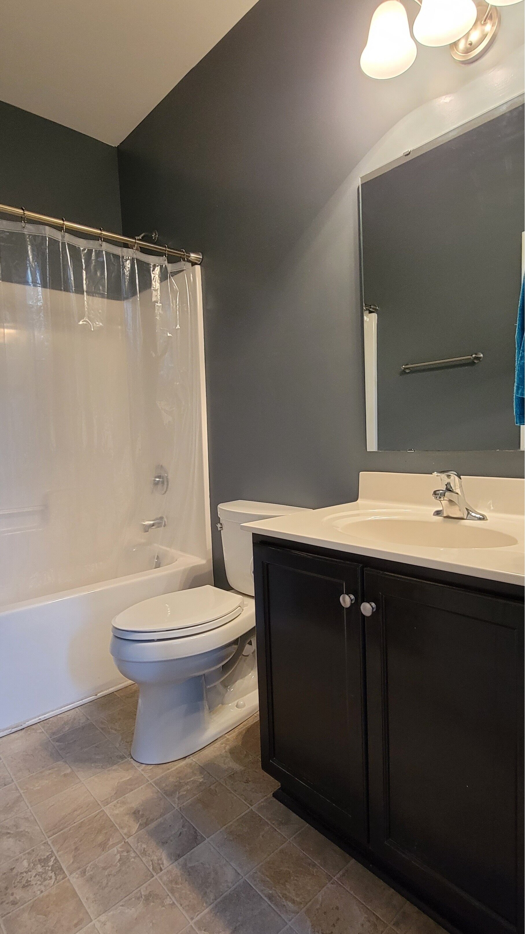
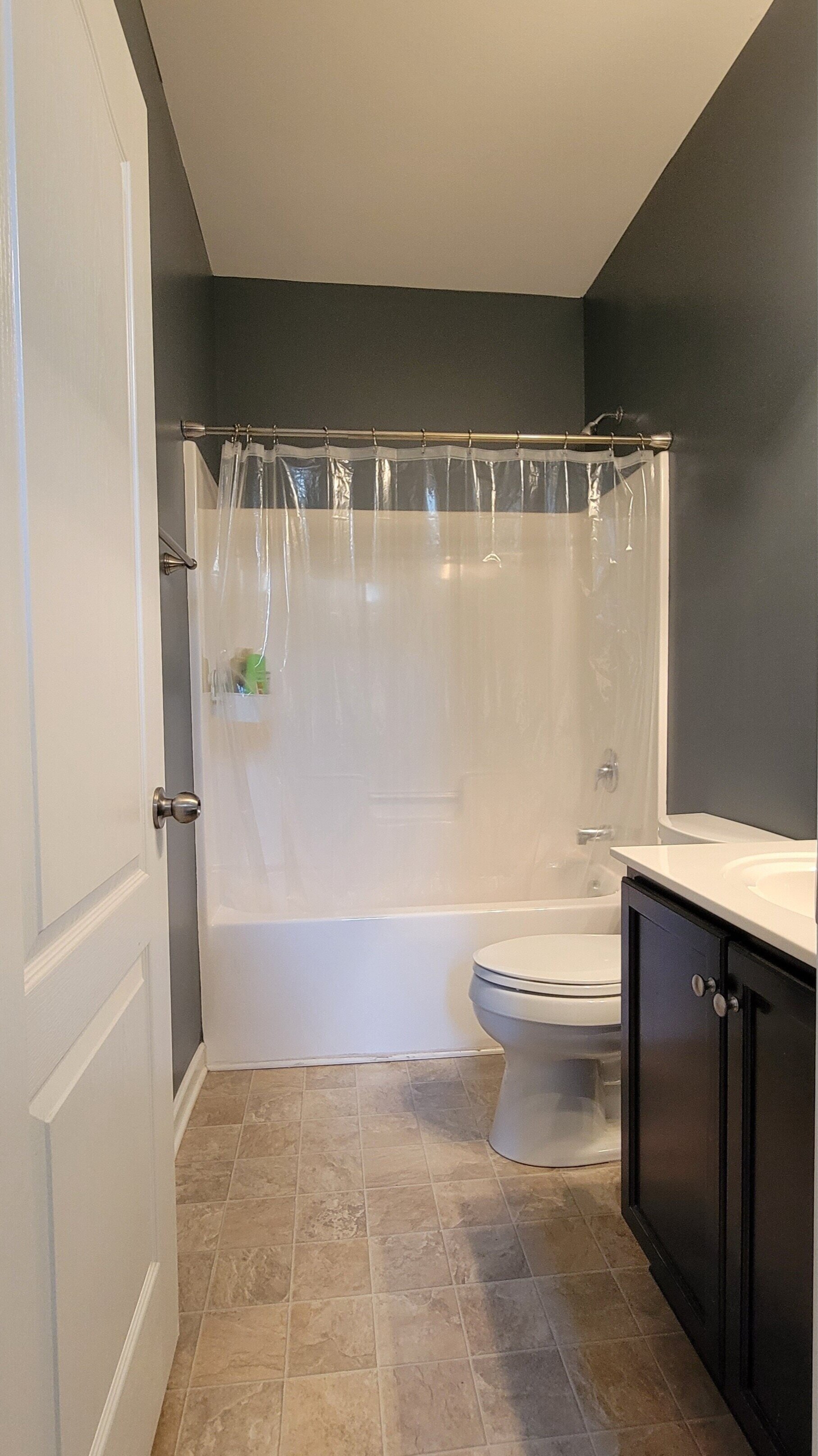
We moved to this house in 2016 and since then this bathroom did not receive any attention. This is my main guest bathroom and I knew that it needed investing to get to look like I wanted so I was just waiting for the right moment. It needed character, color, lightness and to harmonize with the rest of our home. If you know me, I love to use color and personalize each space, and this bathroom was the opposite. It was dark, builder-styled, and never really felt clean to me because of the vinyl flooring. I was determined to make this bathroom a place where guests would come in and feel comfortable and welcome. As a host, I really enjoy making my guest feel at home and something so simple as a well-designed bathroom can make anyone feel special. I am so happy I overcame so many obstacles with this project, the transformation is just what I hoped for and more. Are you ready to see it?
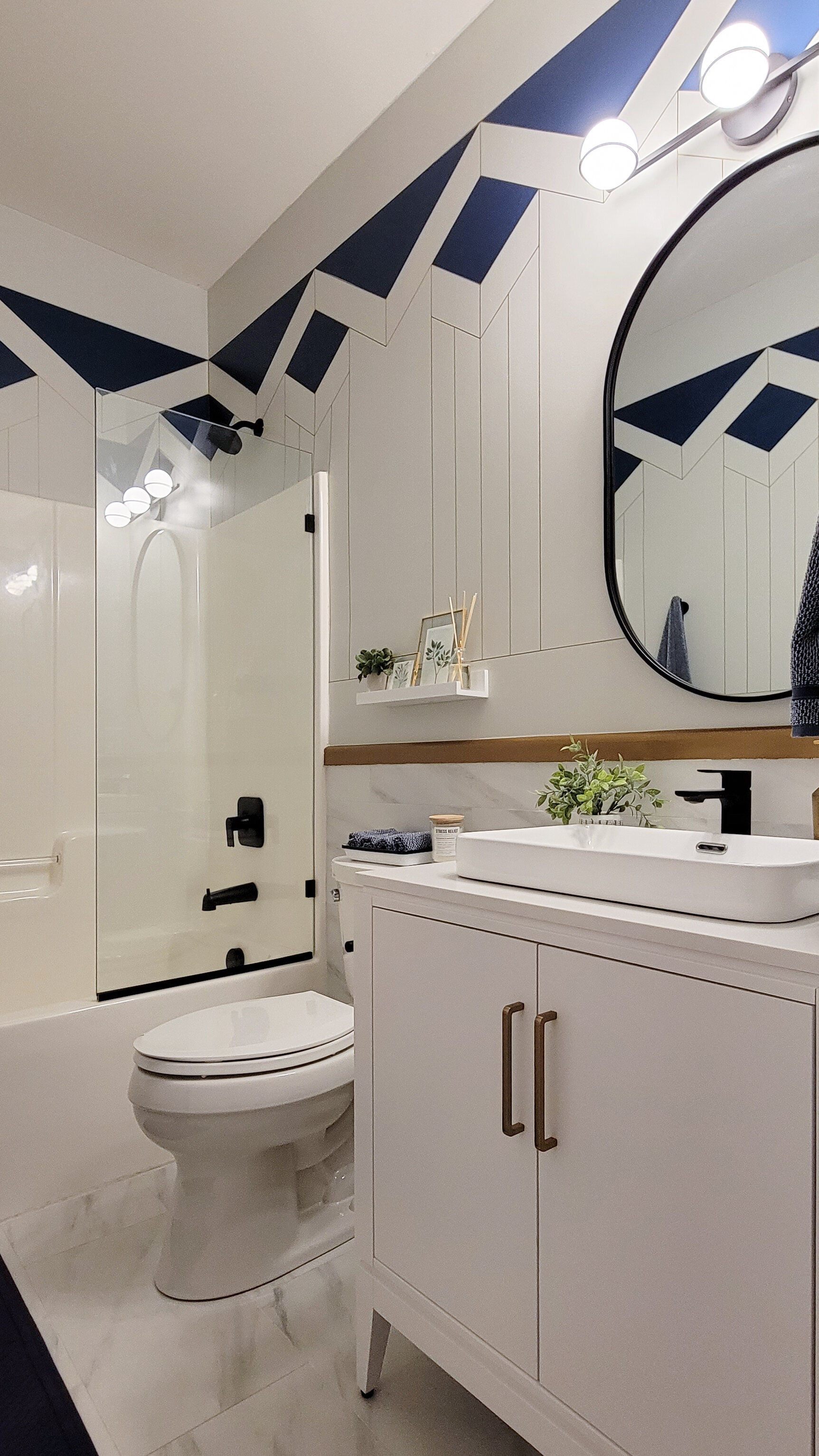
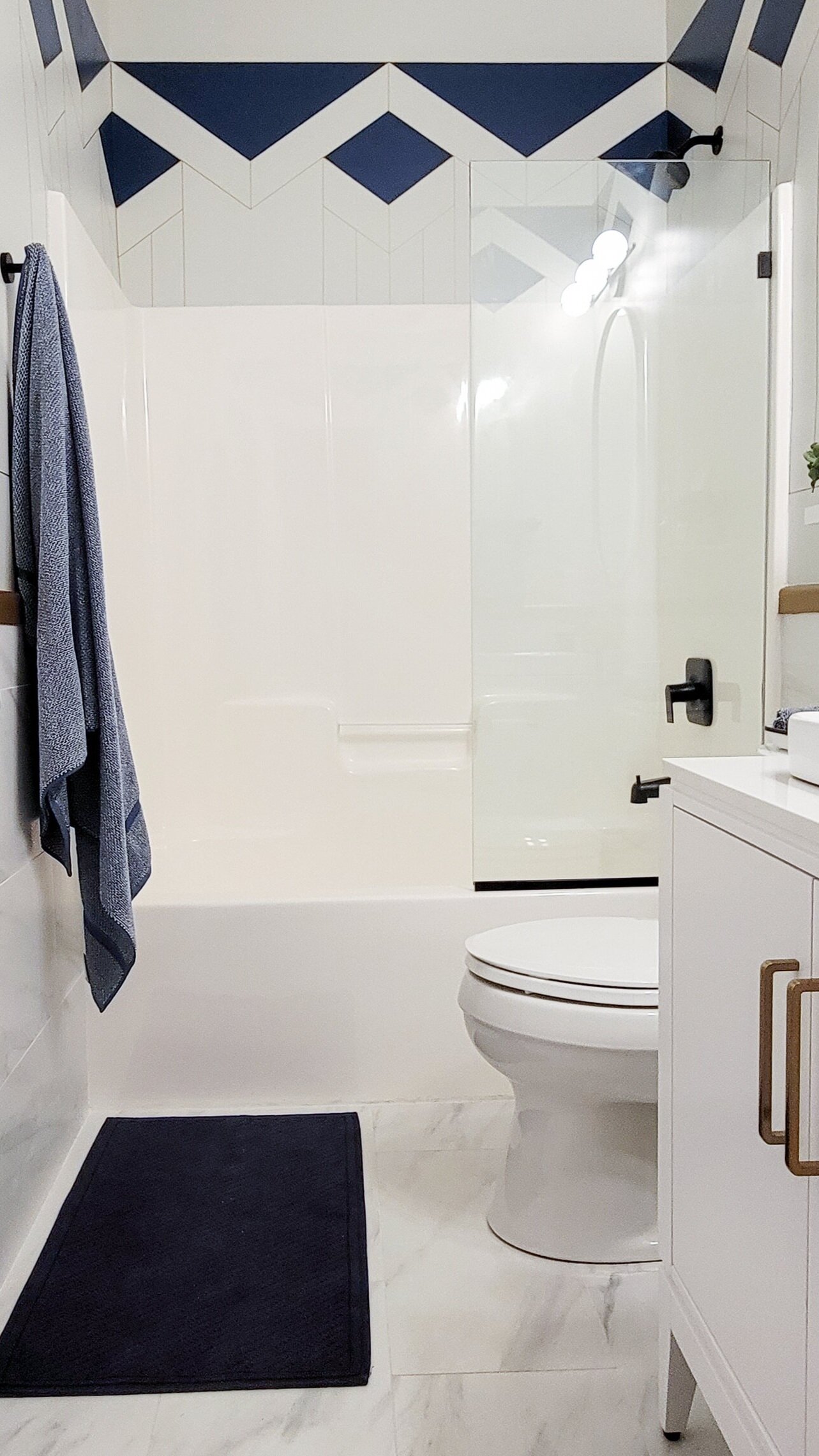

Don’t you feel like washing your hands all the time or is it just my post-pandemic trauma talking? I am obsessed with the result, some details had to be changed from the original idea but most of this project was true to the design and the goals I had set. Now it feels much bigger and refreshing.
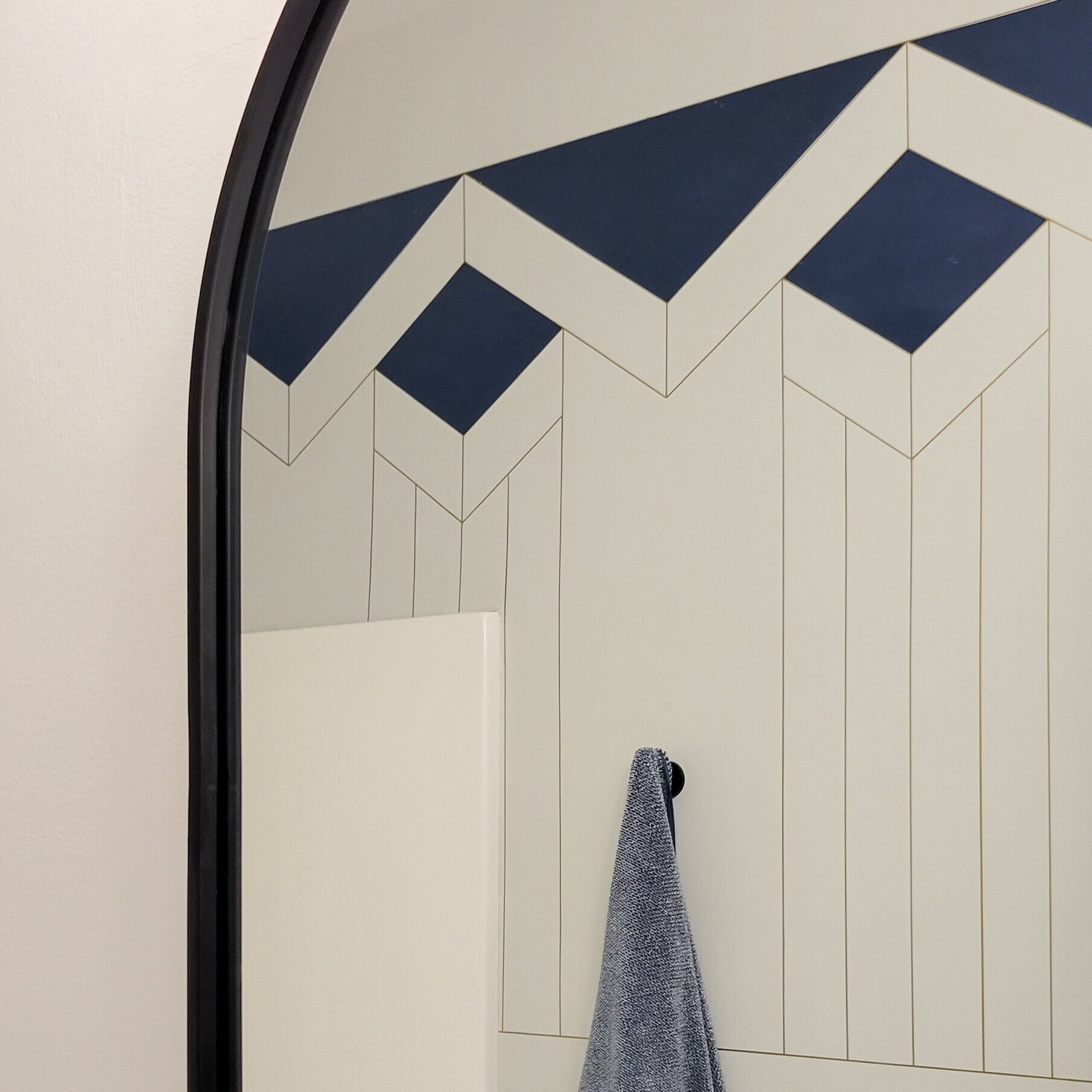
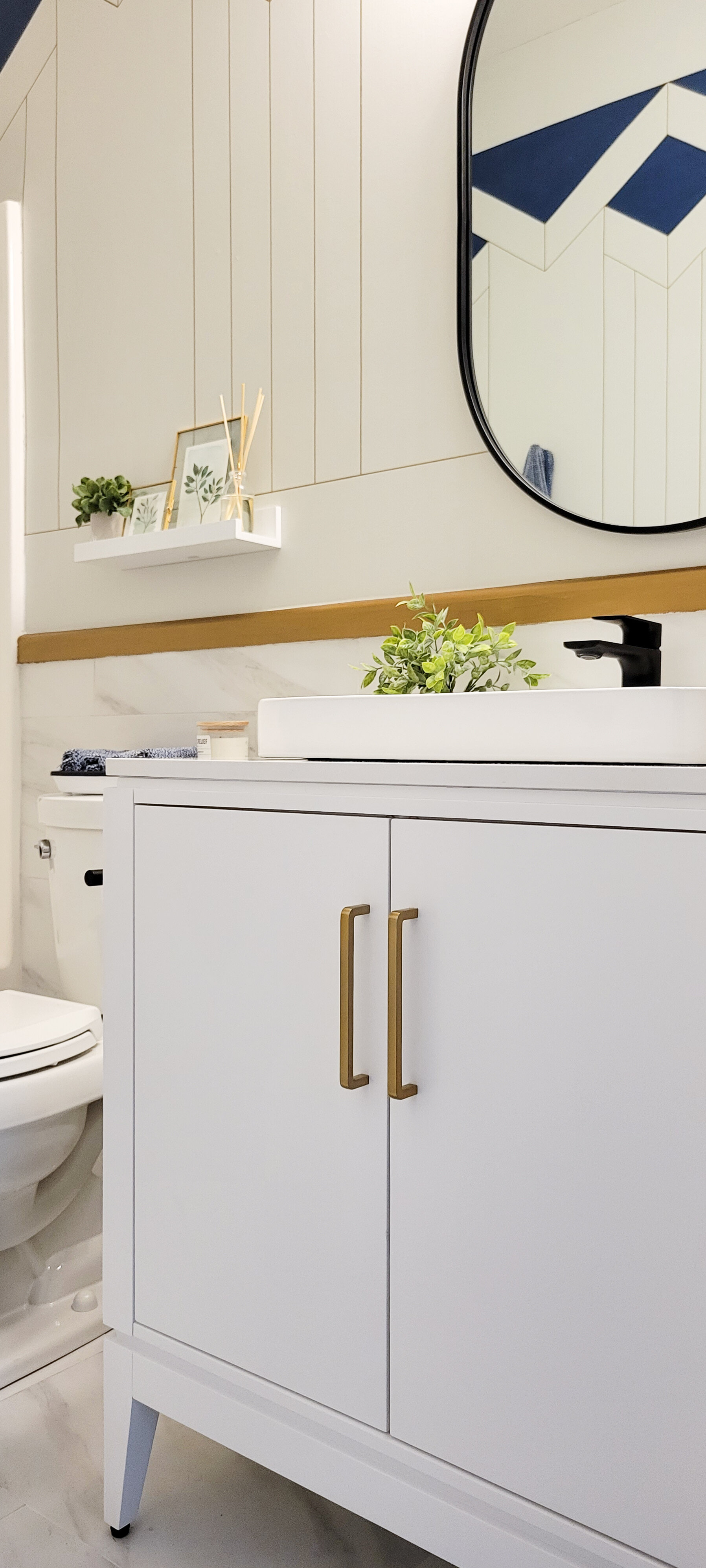
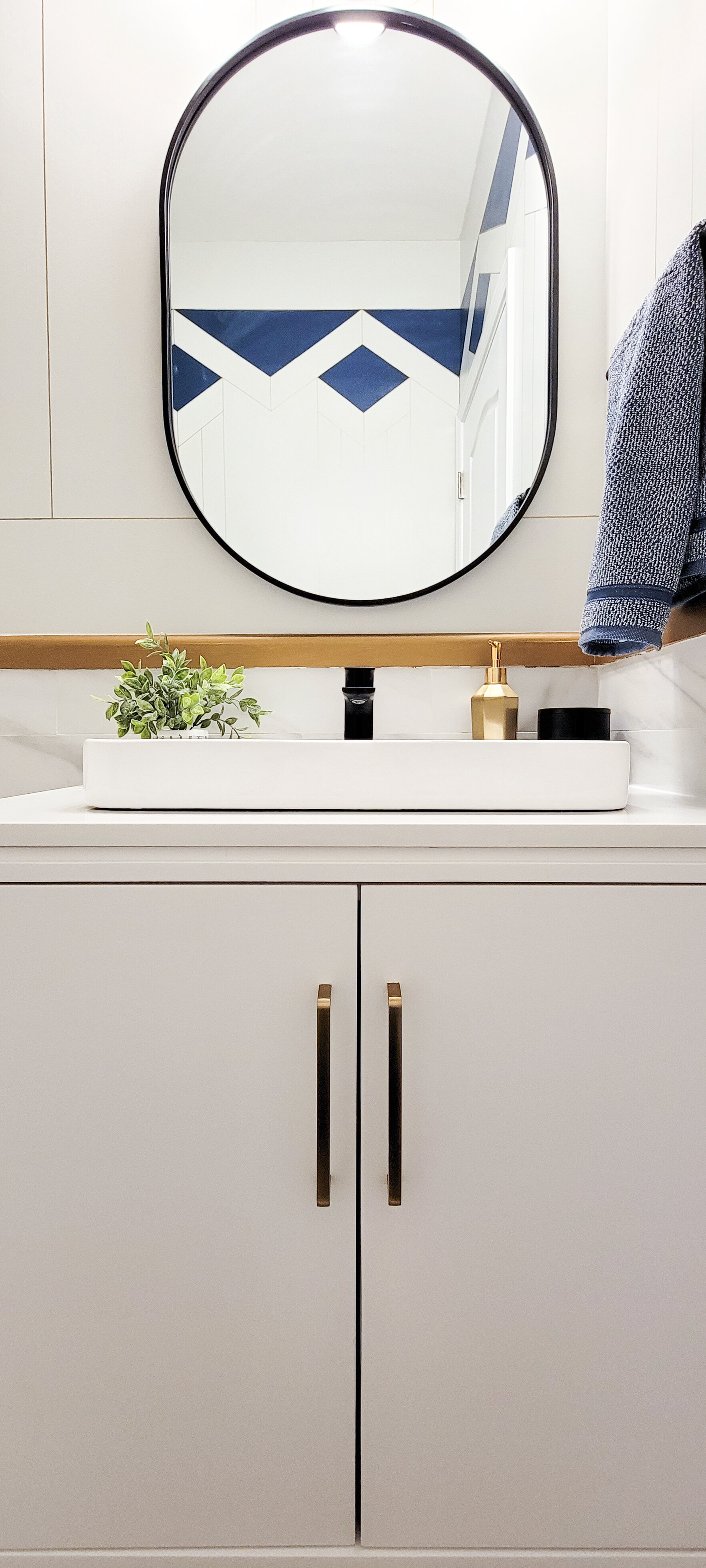
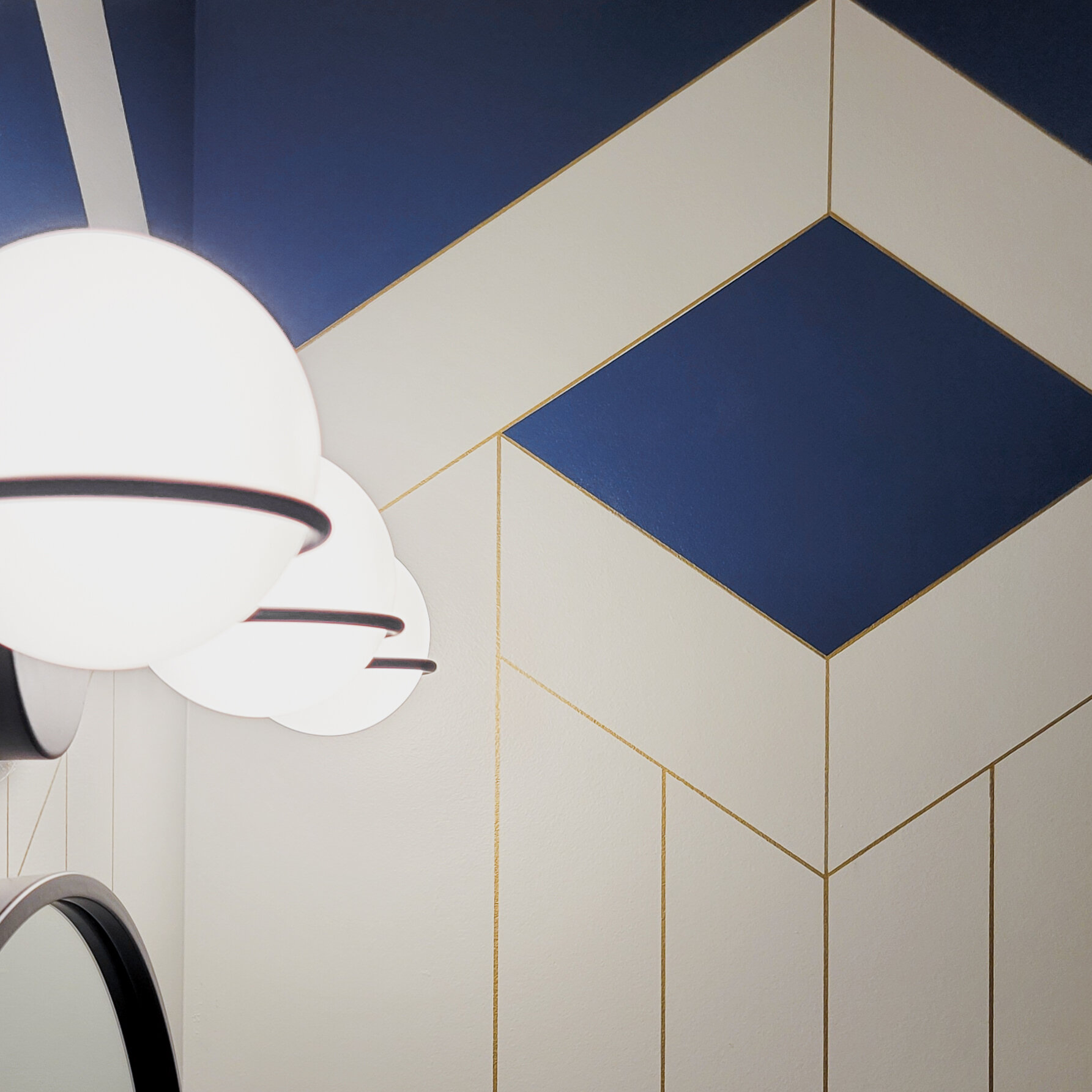
The wall design looks like wallpaper and the gold finish was the best plan B for this design. If you’ve been here from the beginning, you know the original idea for the walls was to use half-round molding for all the lines, but it proved to be more difficult because most lines had a different angle. My husband suggested the oil-based metallic pens to paint the lines instead and it was the best idea. It looks much more polished and the thickness of the line is perfect. You also get that reflection of the light and make it magical.
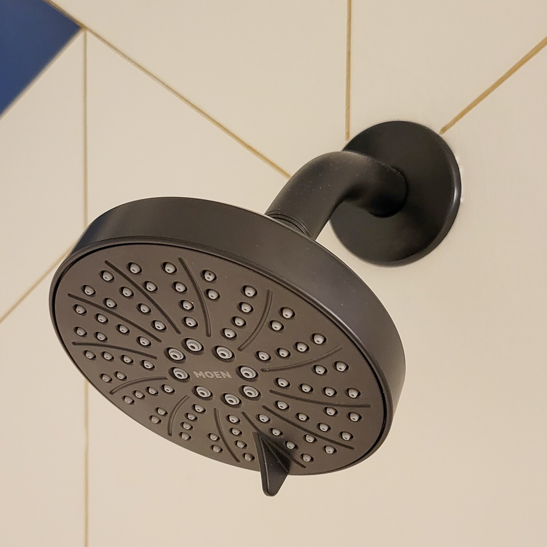
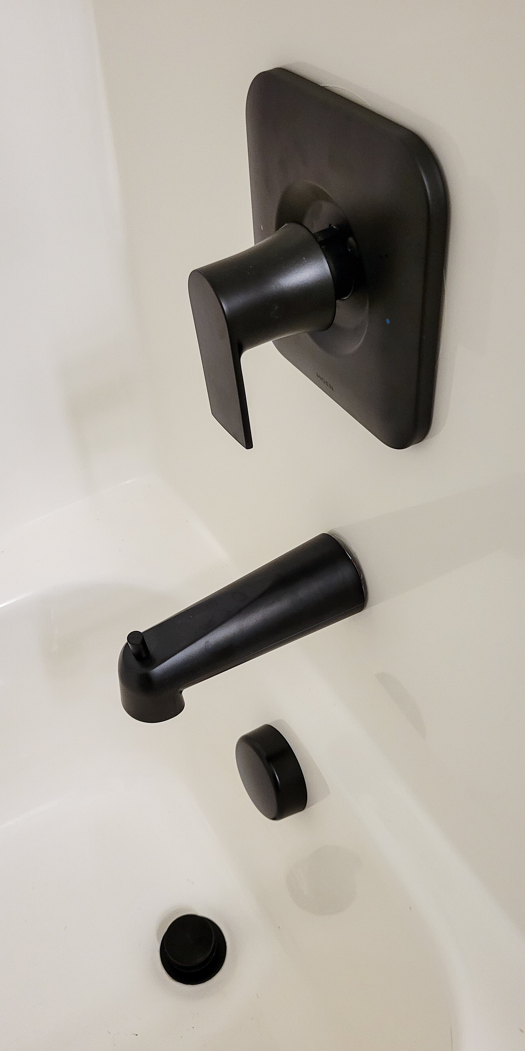
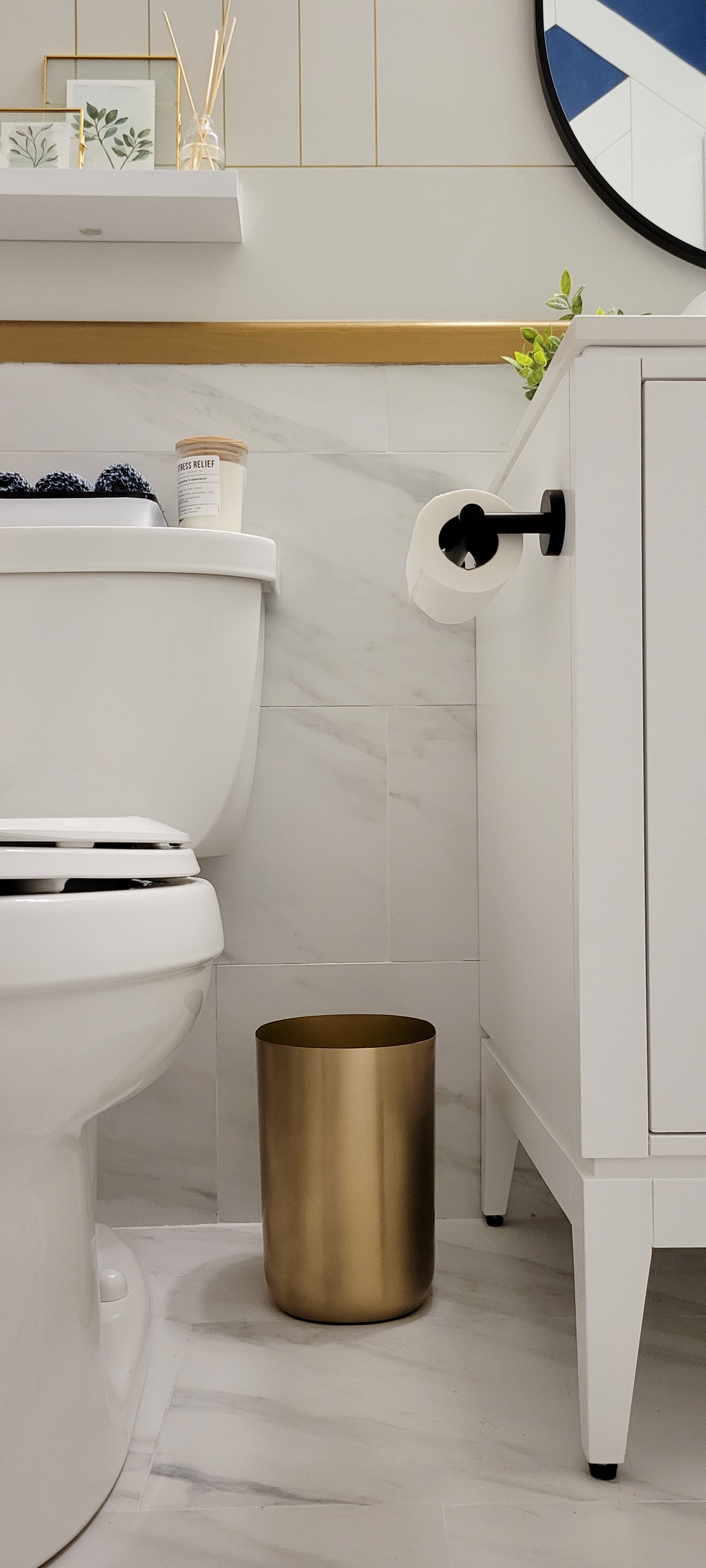
However, the show-stealers are the matte black finishes, the vanity faucet being my favorite. It’s so sleek and cool! I was ready to ditch all the polished chrome and change it with a beautiful combination of black and brass. I also learned so much when it comes to fixtures, had several setbacks due to them not being the correct brand, color, and size. Since I didn’t take out the original shower, I had to stick to the valve and sizing that was already installed in the plumbing of the house.
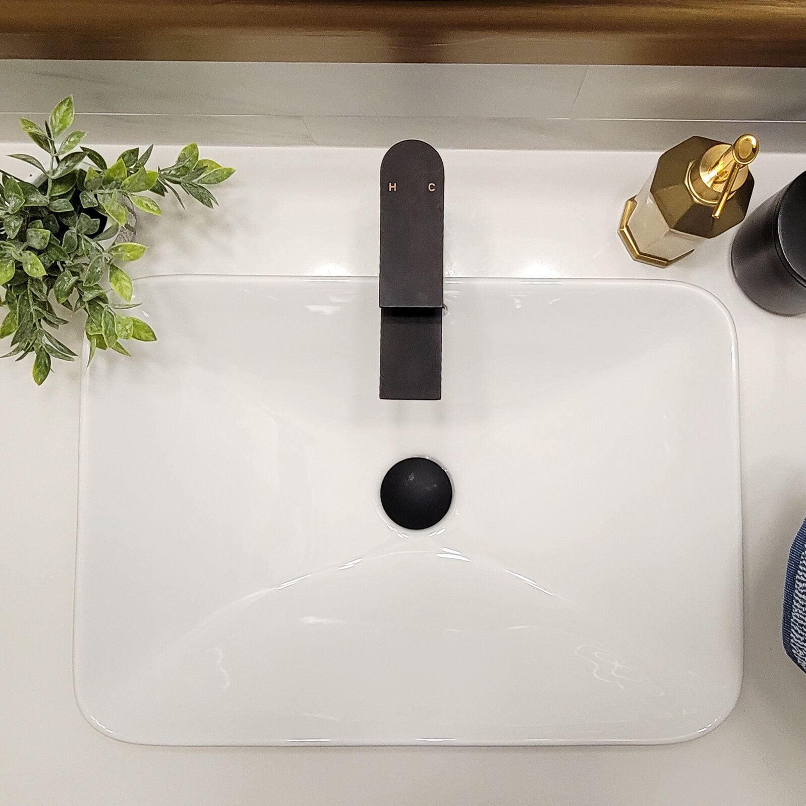
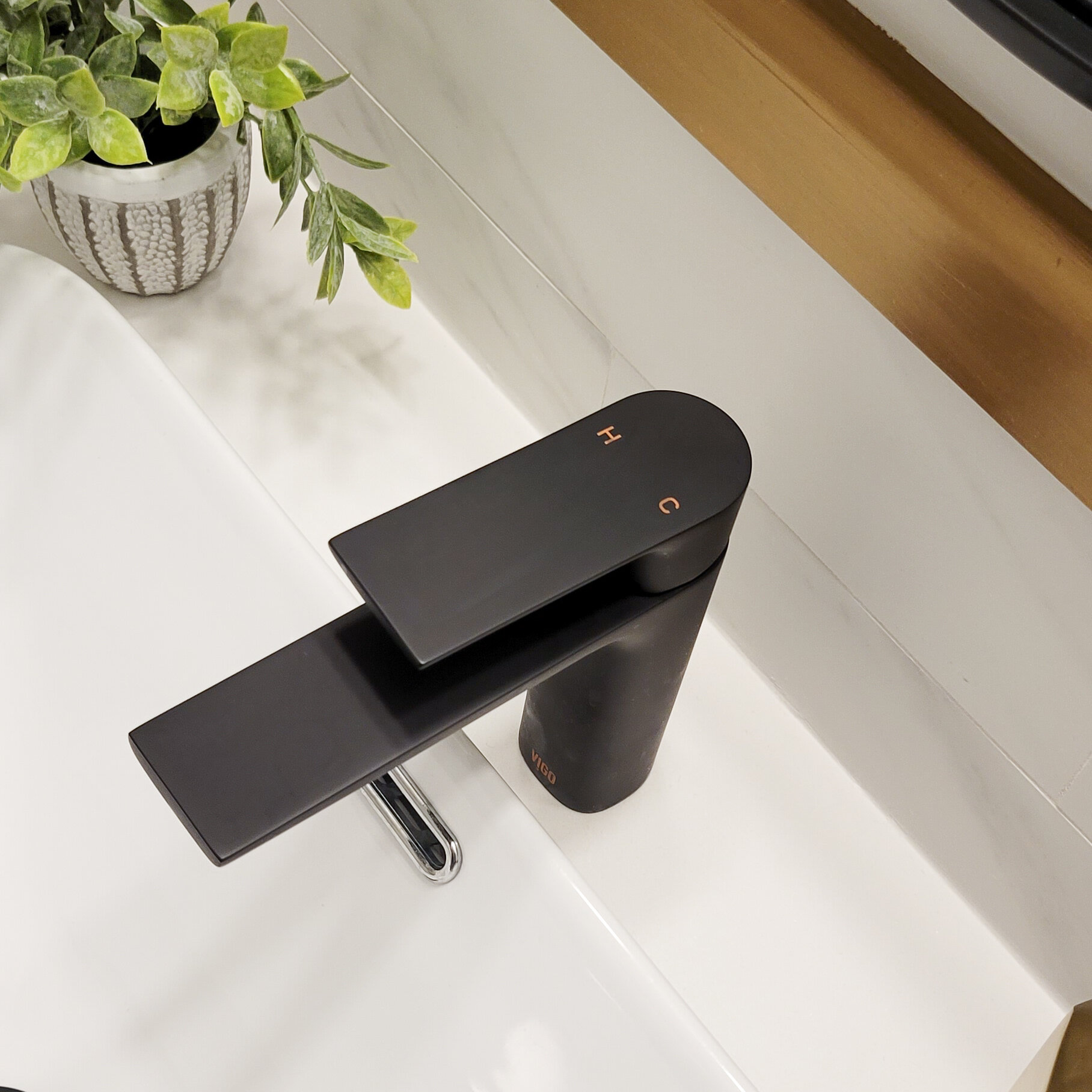
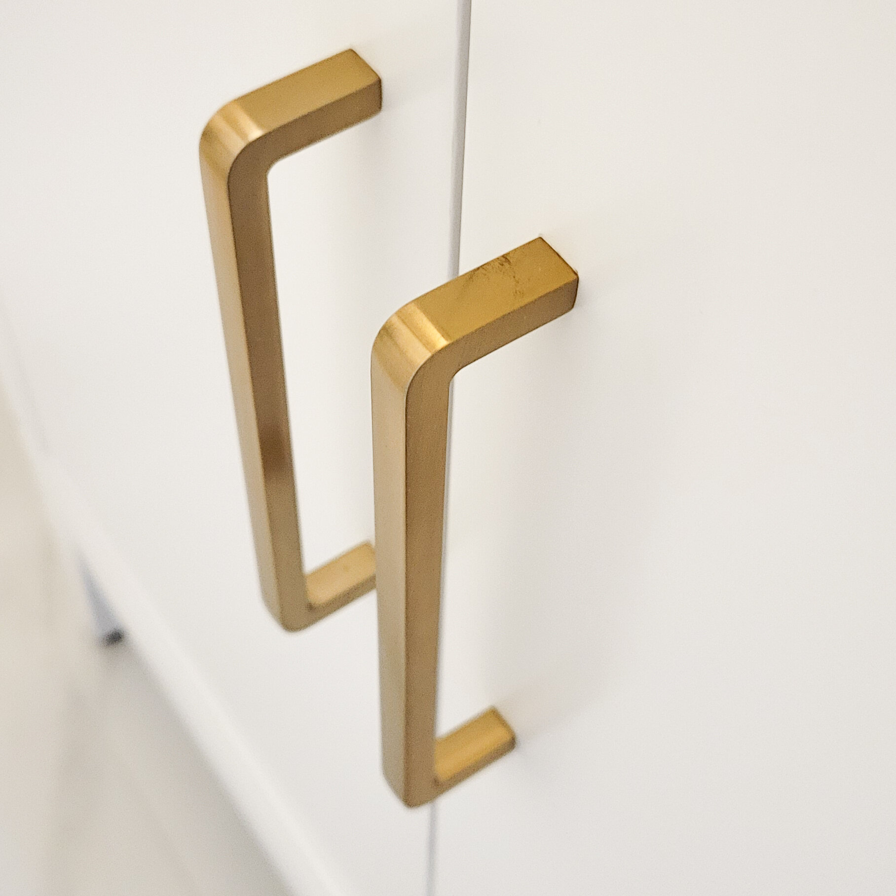
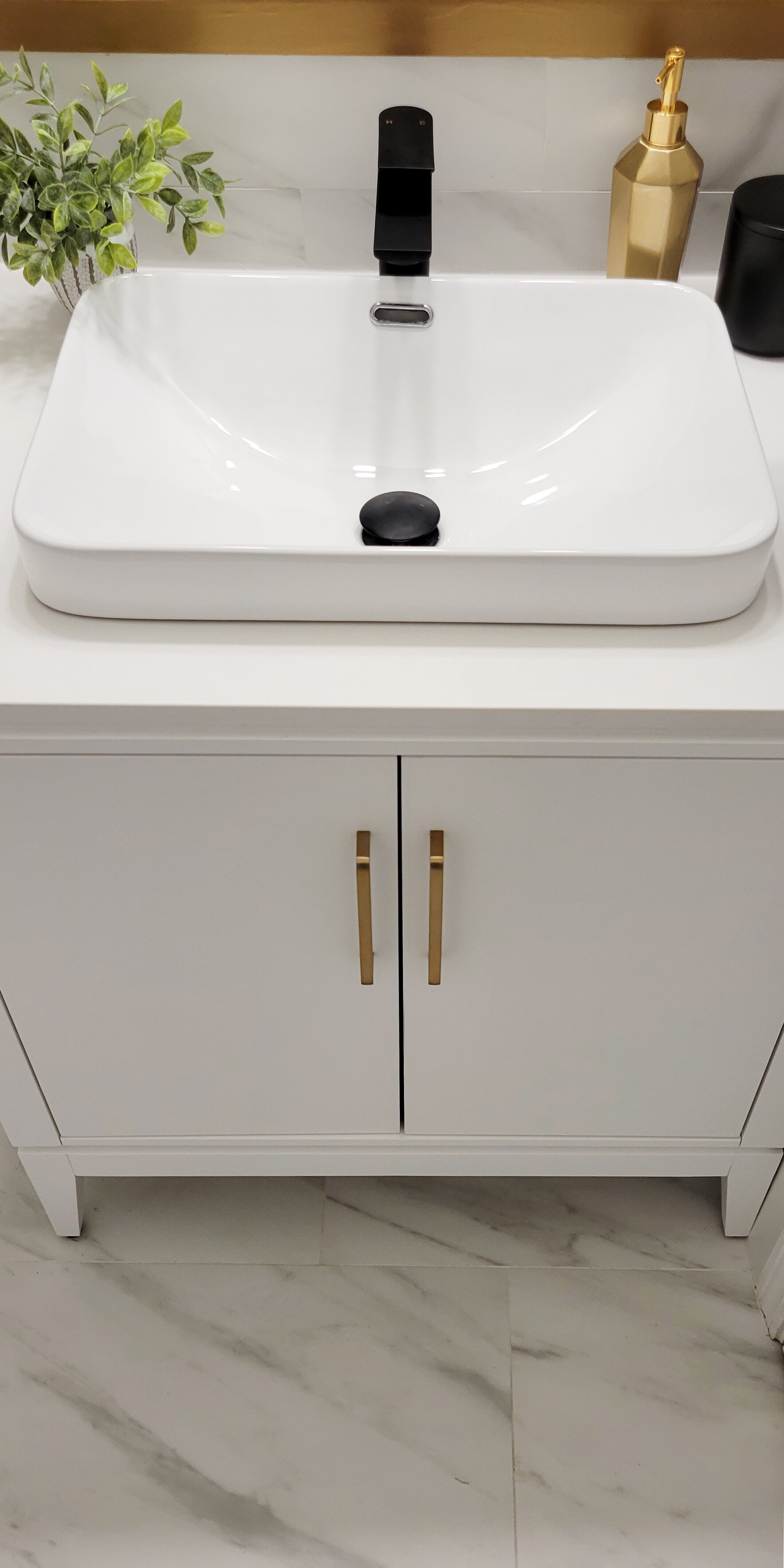
The sink is another favorite, I really wanted a vessel sink for this bathroom but not as tall since I have 3 kids that need to reach it, and this vanity was the perfect option. It is the same size as the previous one, but with the vessel, there is much more space on the top to work with. I also like the freestanding style since it helps make the room look even bigger and airy.
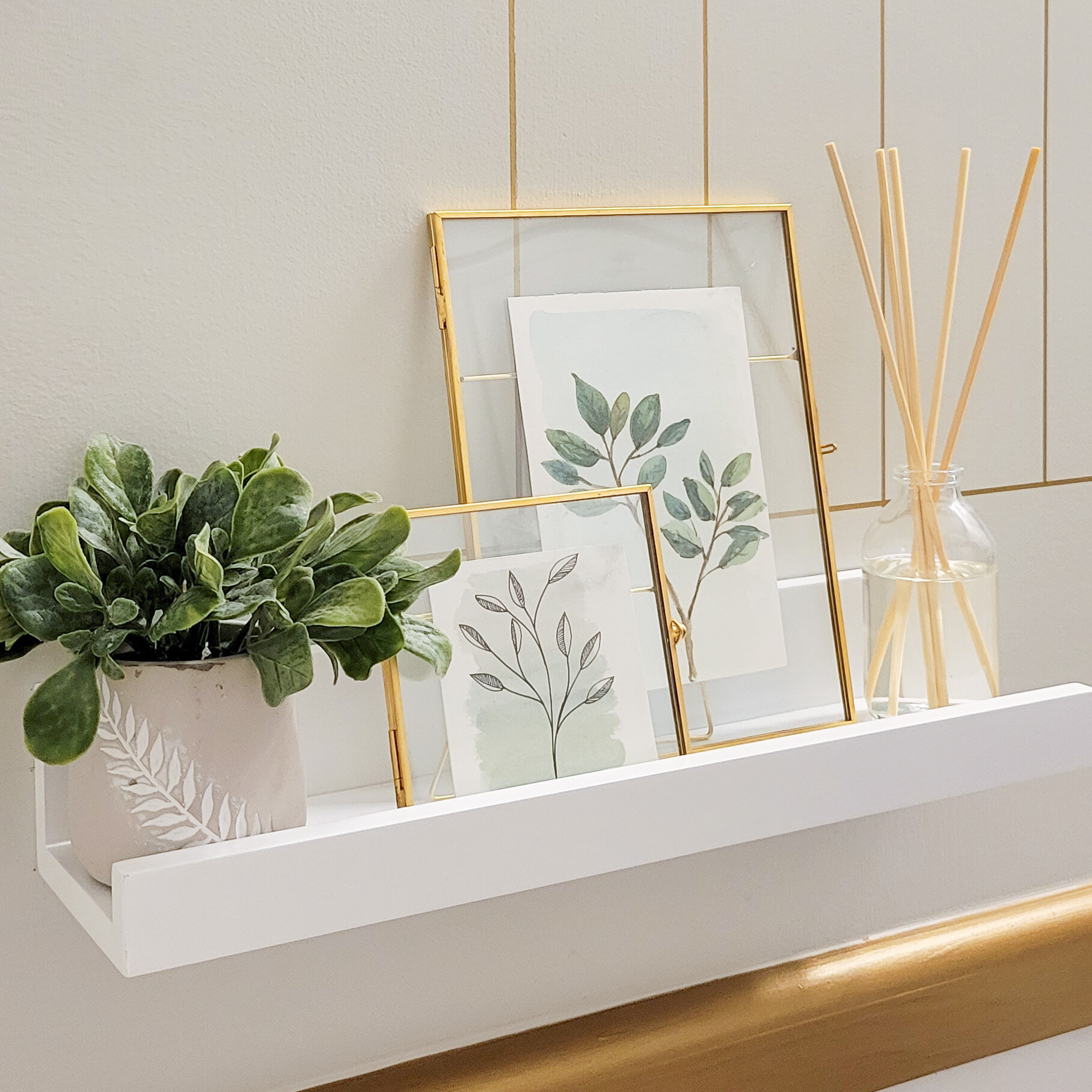
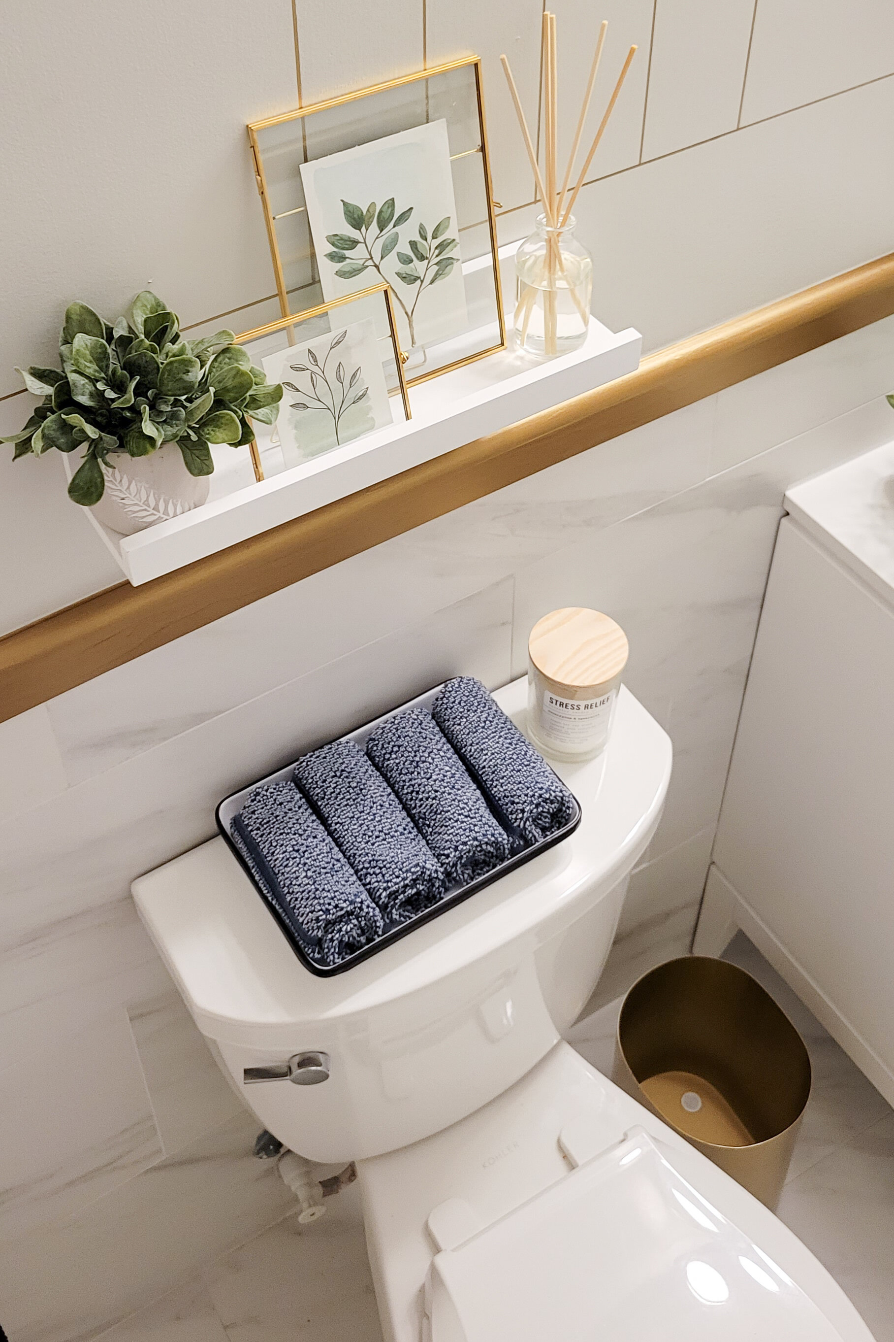
The pill-shaped mirror is also such a good piece to break the lines and add more character. It is a large mirror and I love the reflection of the wall design on it. Wherever you are in the room you are surrounded by this Frank Lloyd Wright-inspired wall art. Since using the gold marker for the walls I thought a gold trim would be a great idea to bring all the colors together and make a harmonious space.
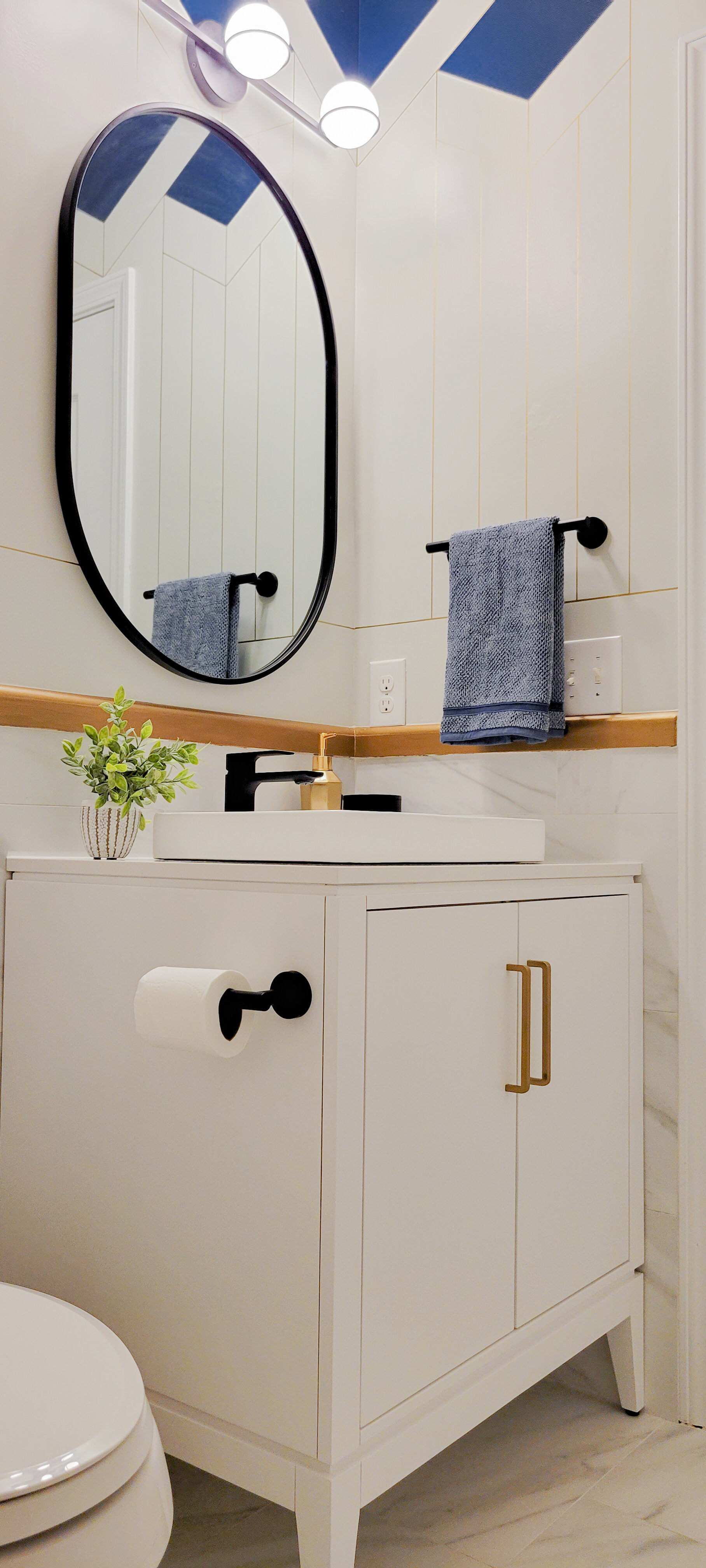

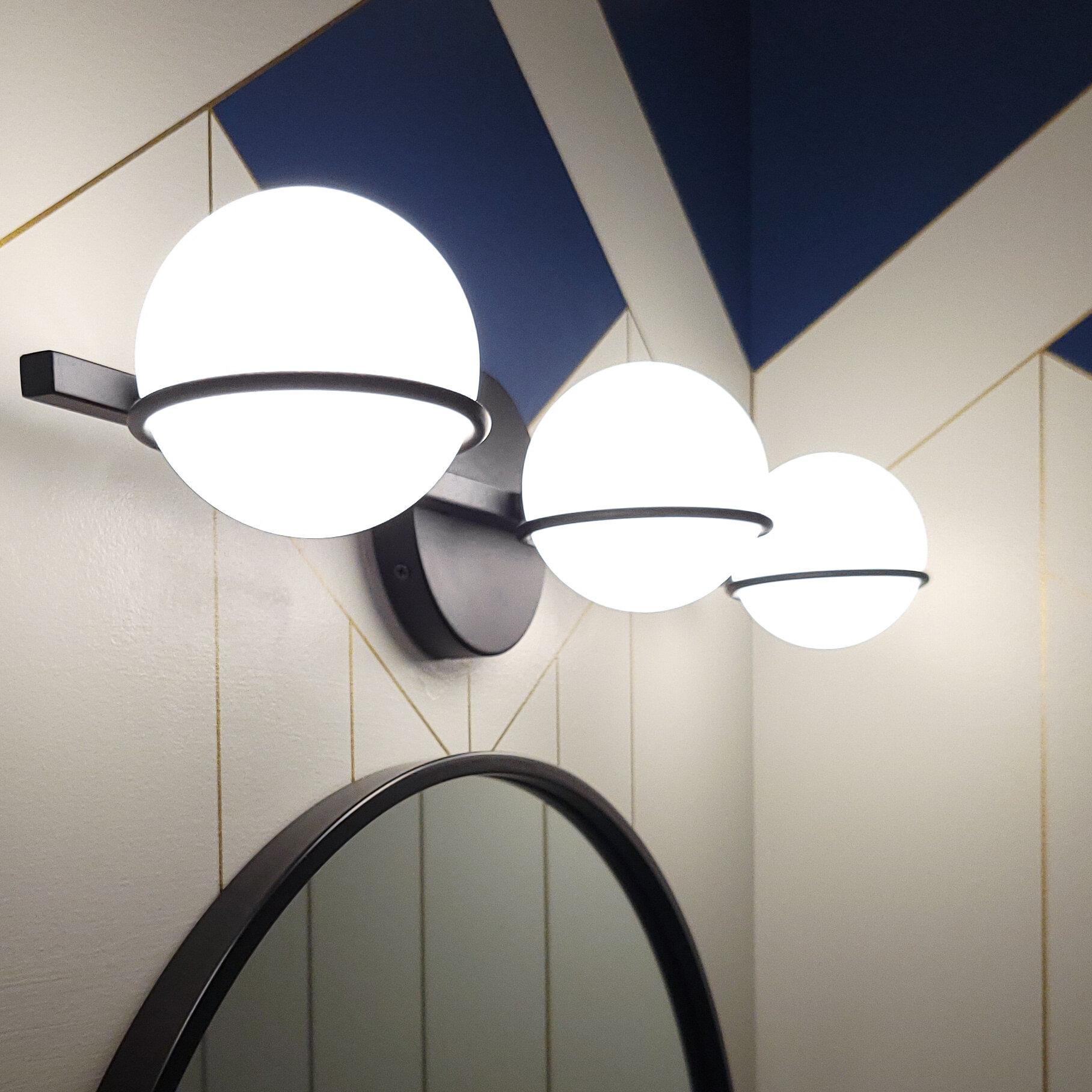
Lighting was another important aspect of this bathroom because it only has one source, the vanity light. I wanted this piece to feel effortless, modern, simple but at the same time powerful. It was also important to use a white pallet in the floors and walls so it would reflect as much light as possible. The result not only makes the room look brighter but also bigger and cleaner.
Talking about flooring, this tile is amazing. From the beginning, I wanted to continue the tile all the way up to the backsplash of the vanity. I love to give the floor this continuation and flow, while also adding texture to the walls.
And last but not least, the glass fixed shower panel. This was the last piece to the puzzle and my husband literally installed it last night. I was a little frustrated last week when we tried to install it and failed due to the walls not being square to the tub. I had to call the supplier and ask for an alternative installation and they gracefully walked me through the changes. Instead of using the clips, I had to use a U channel on the tub to cover and support the uneven space. I am so thankful the link came in time, I was literally waiting for the postman at the door yesterday!
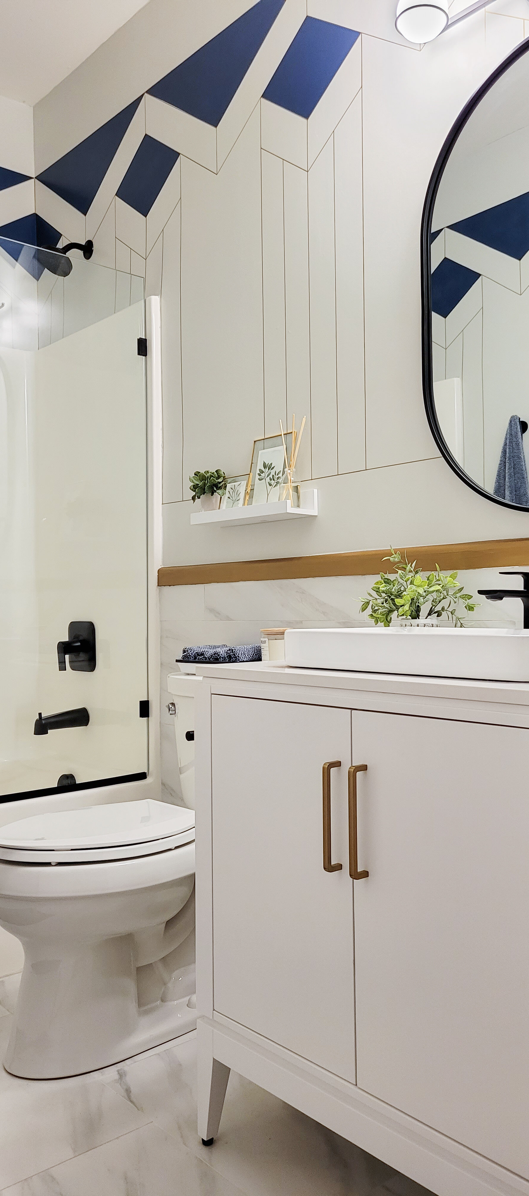
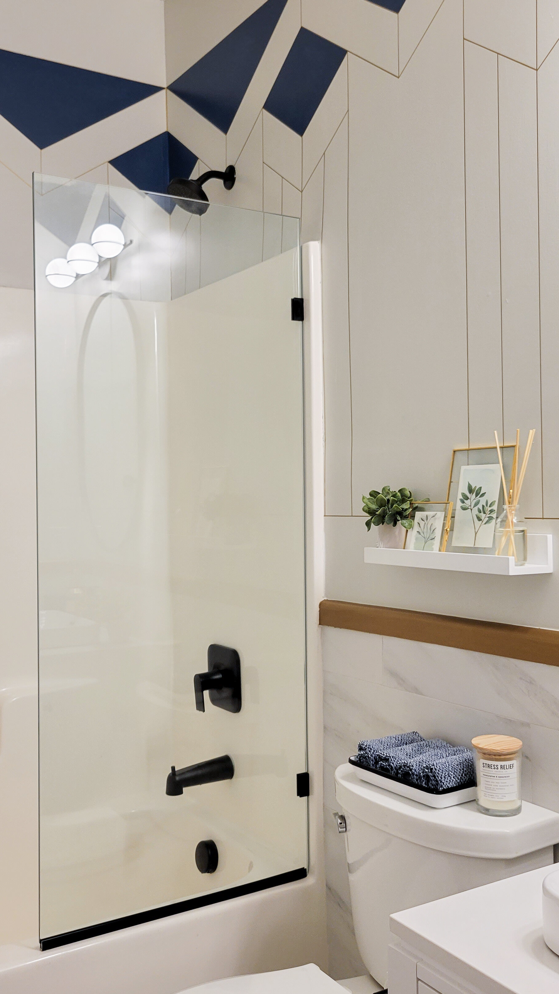
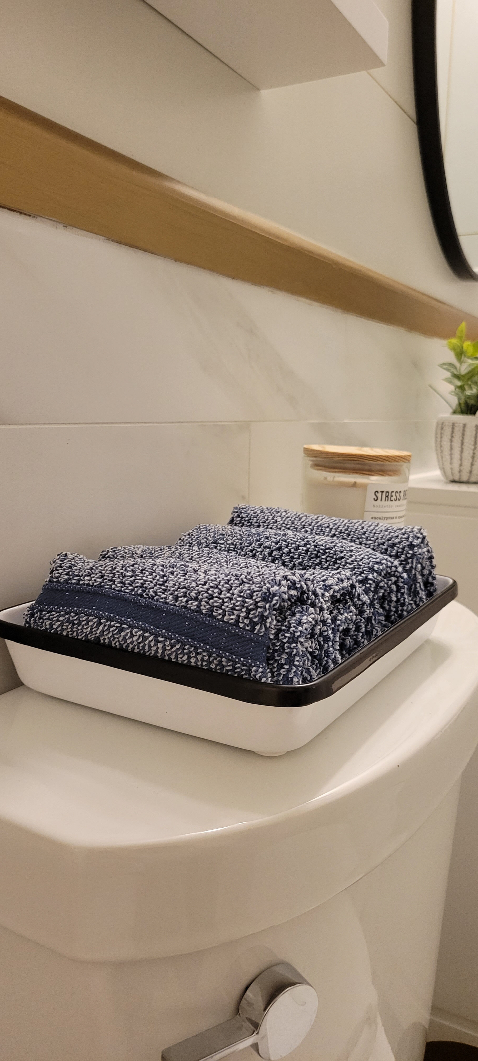
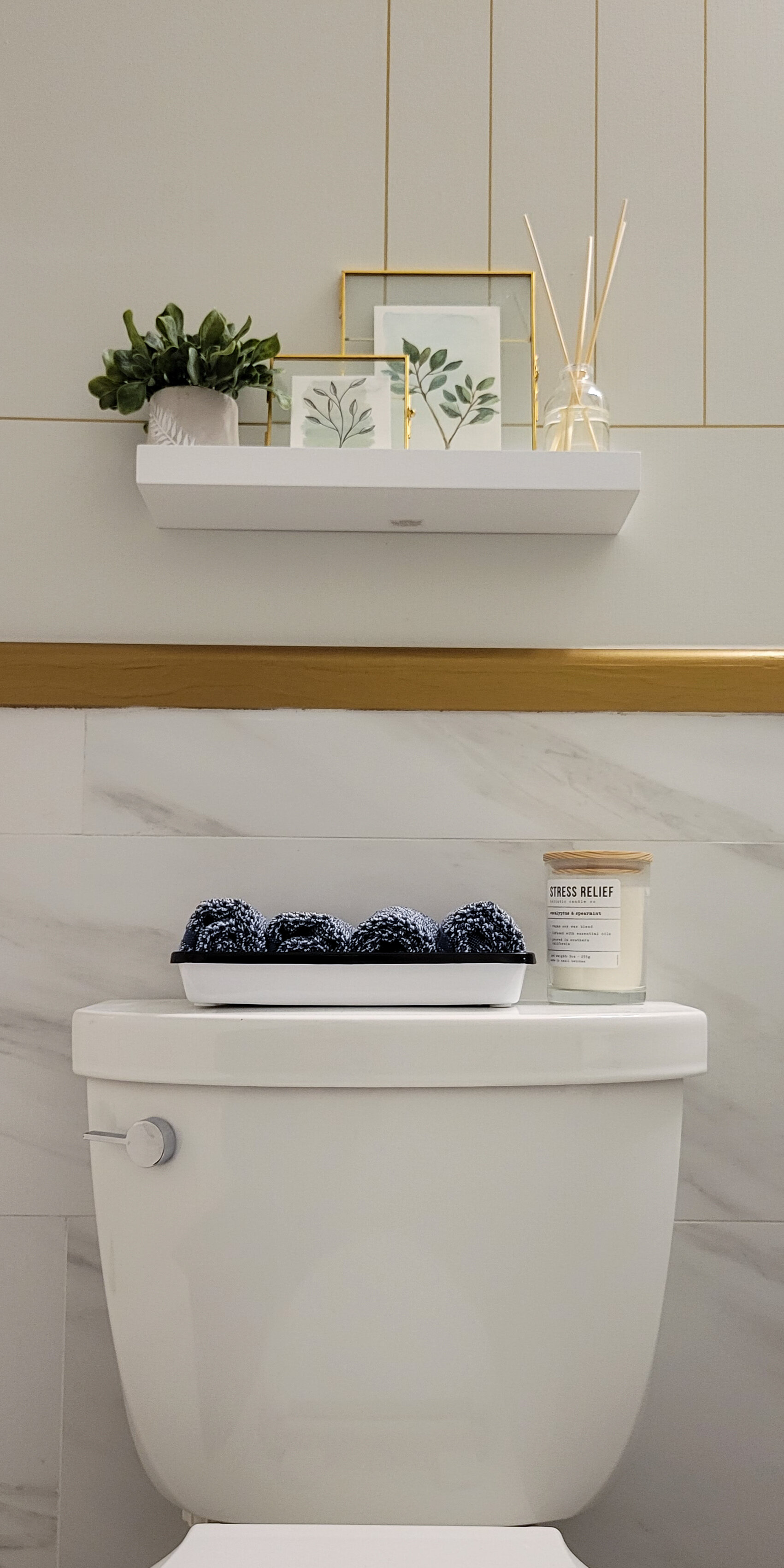
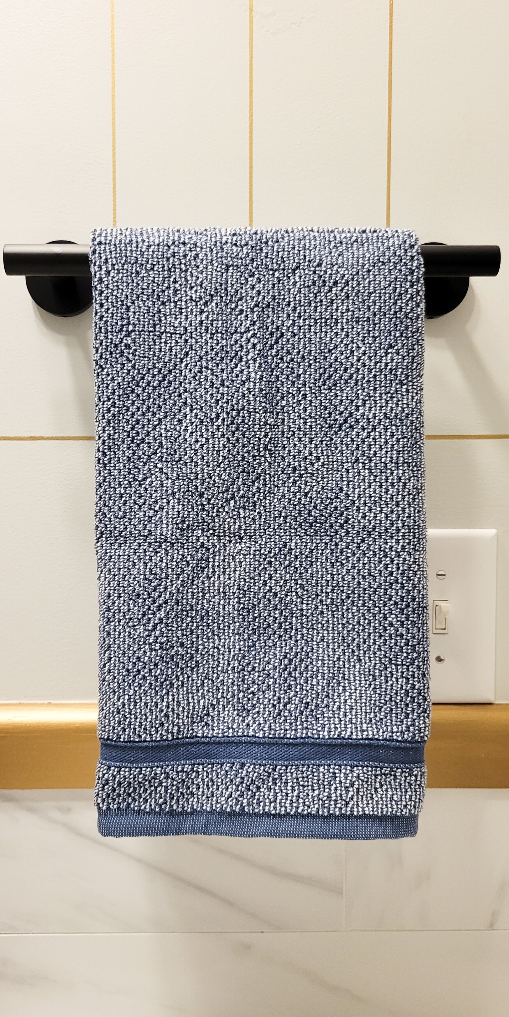
As always I added a personal touch and painted some art in watercolor for the decor over the toilet. I always enjoy making a piece for the rooms I design. I also added some greenery because I think plants make everything look better (even though I am not good at keeping them alive). I also wanted to add more blue tones in the room and used the towels to do so.
And that’s a wrap for this One Room Challenge! I want to thank you for following along, it has truly been an amazing 8 weeks, and I am so happy it’s done. Feel free to share your comments below and I would love to know what’s your favorite part of this guest bathroom.
If you haven’t seen the featured designers’ reveals you should definitely go and check them out. And if you’re like me, and want to see more don’t forget to read the rest of the guest participants and congratulate them on their great work.
Be stellar!
Tina
